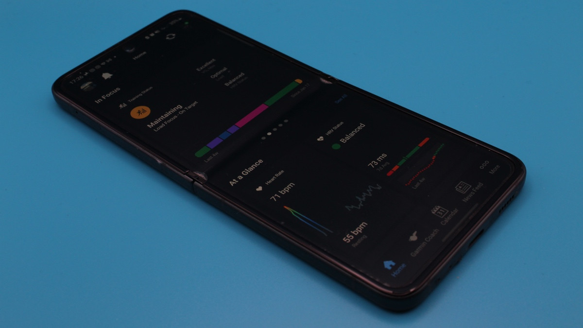
Garmin has delivered something users have been craving for years - an overhaul of the Garmin Connect app.
While still in beta, the Android/iOS app has been given a refresh in the hopes of making the sea of metrics and insights easier to digest.
We've got our hands on the new version of Garmin Connect, and below we'll be providing an in-depth look at everything new - and clearing up what Garmin has kept the same.
Garmin Connect update release date
Wareable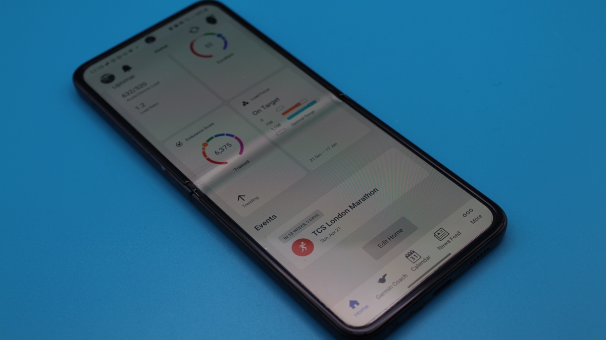
Garmin announced the arrival of this Connect update at CES 2024 alongside some new hardware, but there's currently no official word on when the full rollout will take place.
There's also no option to manually join it, making this an invite-only affair for now.
Instead, users will be randomly selected in a deliberately protracted rollout in a pop-up notification inside the app, so be sure to check every day for this if you're keen on testing it out.
Also, if you somehow manage to dismiss this invite, you can find it by selecting More > Settings > Beta Program.
This option only appears once you've been invited - as we say, you can't toggle the new beta on/off just yet - and allows you to leave and join at will.
The initial setup: All About You
Wareable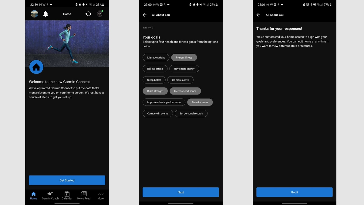
Once you accept the invite, you'll immediately be taken to a set of screens that ask you to rank your priorities and goals.
It's like starting from scratch so Garmin Connect can help better display information from the main dashboard (though you can edit this easily later).
This only takes a couple of minutes to complete, and you'll be able to select up to four goals before scoring a set of features from 1-5 in importance.
The all-new Home section
Wareable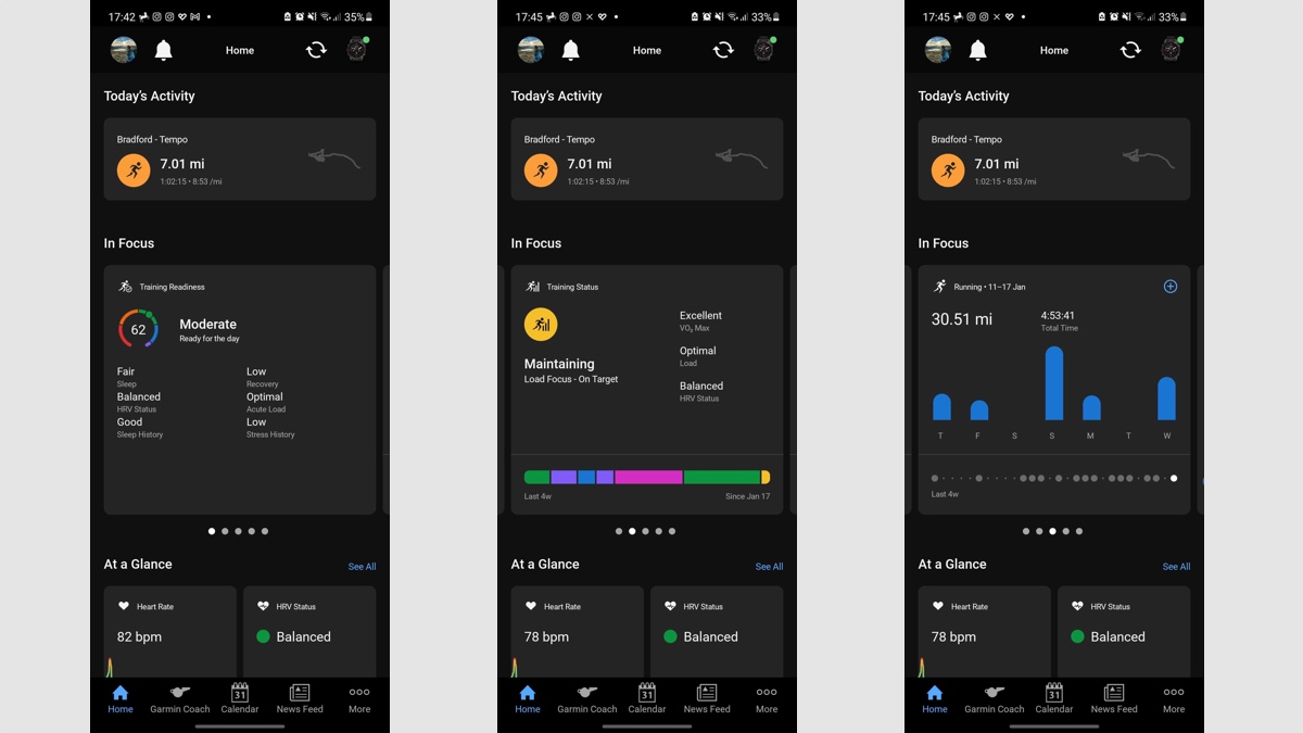
Once you've completed that initial bit of setup faff, you'll be shot directly over to the all-new Garmin Connect.
Much of the in-depth data and insights have remained, with the major change being delivered to the 'Home' section. Instead of a stack of cards, this will now be split into the four richer sections that we show below.
Today's Activity
This one is fairly self-explanatory. If you don't complete an activity in the day, nothing will appear here, but it allows you to very clearly jump into your recent workout from the activity bubble.
These remain categorized the same as before - so run workouts will be orange bubbles, while something like yoga will be a blue bubble - and you'll have to swipe left to view a second (or third) activity if you record one.
In Focus
This is where things start to get interesting - and much improved from what we had before.
Instead of the uniform bubbles we had before, In Focus now provides a rich set of cards that you can swipe left through. Instead of just your Training Readiness score and grade, this now includes the six factors that decide the score, for example.
The idea here, we'd guess, is to shorten the journey for users. Whether it's Training Readiness, Training Status, or Body Battery, you no longer have to tap multiple times to see the more in-depth elements of each feature.
It works well - and is easily customizable once you scroll to the bottom and tap 'Edit Home'.
Wareable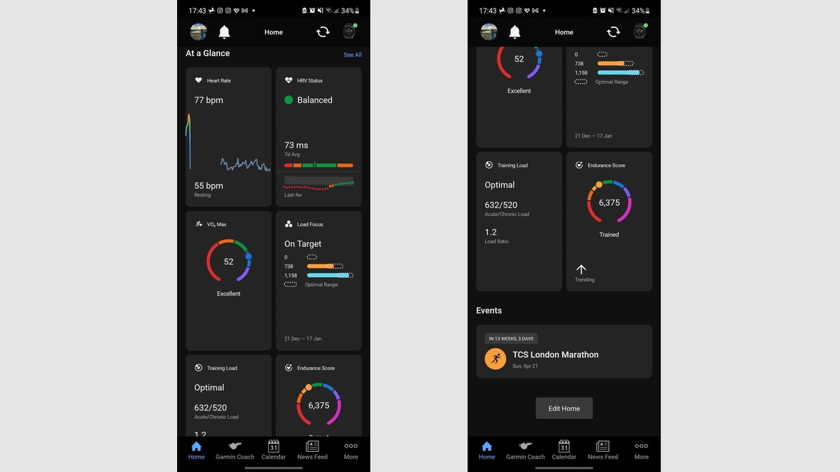
At a Glance
If you continue scrolling past the first two sections, you'll then be met with more of Garmin's metrics. In 'At a Glace', as you would expect from the name, they're not as in-depth as what you'll see above.
These are kind of like reformatted versions of the old horizontal bubbles. They're a definite improvement, however, and you can add up to eight of them.
Again, it's all about streamlining the experience and saving you time. Looking at the graph of your last four weeks of HRV no longer requires three taps, for example - it's all right there on the Home dashboard.
Events, Training Plans, or Challenges
If you have an ongoing plan with Garmin Coach, or you've set up or entered a race or challenge, this is where it'll appear on the new dashboard.
There's not a ton of information here - and, again, the screens that appear once you tap through haven't changed - but it has been neatened up.
Considering this wasn't previously accessible from the Home section, though, we like that something like the race countdown is now easy to view.
Garmin Connect web app
Wareable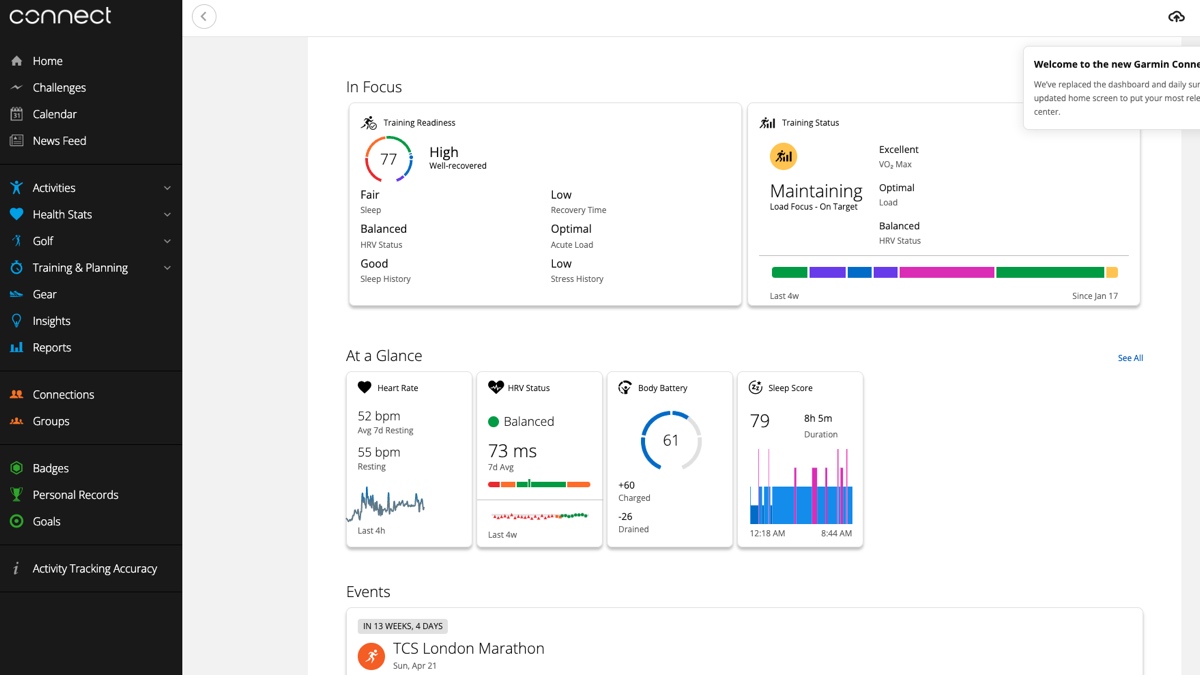
It's not just the Garmin Connect app for iOS and Android that's received the new look - the web app will also match the new layout and your 'In Focus' and 'At a Glance' cards.
When you make a change on the web app, this will be replicated on the mobile app - and vice versa.
Iit's just the old dashboard and daily summary that's been removed here. All the other menus and screens remain as they were before.
What's unchanged?
It's not clear the extent to which Garmin will tweak things further before a full rollout, but, at least for now, the secondary menus will remain the same.
Essentially, everything that you would typically seek out from the 'More' tab or tap through - Health Stats, Performance Stats, Gear, Settings - is just as before.
Even Garmin Coach, the Calendar, and News Feed tabs have remained in place, so this update is mostly focused on revamping the Home dashboard to be more digestible.
Wareable verdict
Wareable
Our initial impression of the new version of Connect is a positive one. Garmin has changed what it needed to (the main dashboard) without watering down the experience by simplifying the secondary menus.
We spent so much time in the old version of Garmin Connect that we began to accept the slightly clunky, endlessly scrolling nature of the dashboard, but there's no doubt the richer cards are an improvement.
Ultimately, Garmin faces a pretty unique challenge with Connect; presenting such a massive amount of data and tracked metrics is difficult to make digestible. And that's especially true when everybody's priorities are slightly different.
Outside of Apple Health - and perhaps Google Fit - no other wearable companion app boasts the level of insights, but this update does move Connect closer to something easier on the eye - not unlike Strava.
How we test
